This post is a round-up of the projects i've been finishing before my assessment in a couple of weeks.
We had a task of producing 8 postcards representing London as we see it. They had to have a common theme running through each and be personal to us.
I went with a very traditional style of rectangular postcard with black lines on the back with spaces for address, text and stamp. my postcards were photos printed at Asda, but with the postcard layout found on google images glued on the back. a bit of a cheat but i think they look pretty cool.
My theme was the underground, as it's so representative of London and both tourists and people who live here must use it on a regular basis.
It's both the bain of peoples lives, and what they rely on to travel. Its interesting how much we depend on it.
I'm quite claustraphobic, so although I enjoy the underground (people watching, especially) i hate the cramped conditions and horror stories of fires and being unable to escape.
these are my 4 favourite postcards i made. the colours are all quite similar (red, blue, white, black) but each has it's own message.
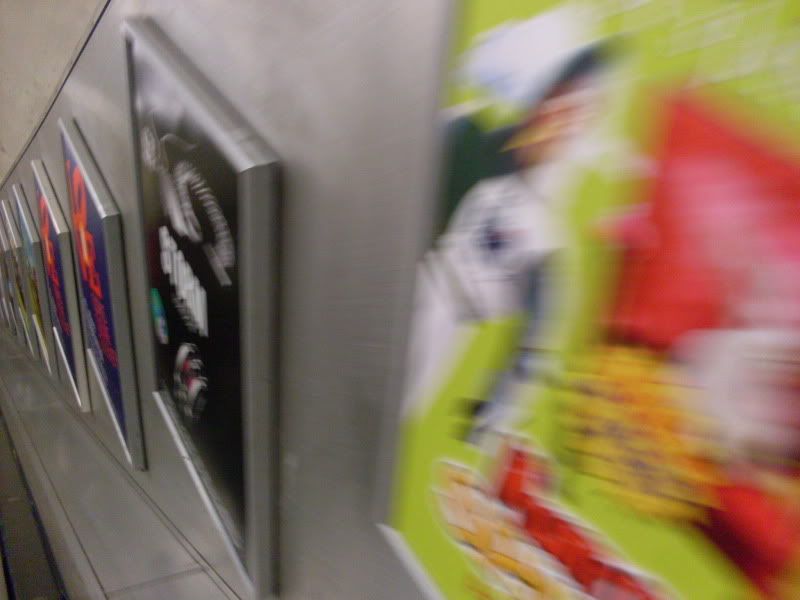 this postcard shows the descent underground, the silver walls feel industrial and harsh. I really like the lines across the image, it draws the eye to the direction you're heading.
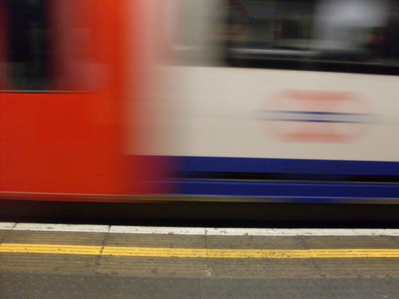 I didn't mean to take this one, I was trying to turn my camera off but pressed shoot instead. I like the mix of blur and clear, the train looks like it's going so fast but was just about coming to a halt. Everything feels sped up underground.
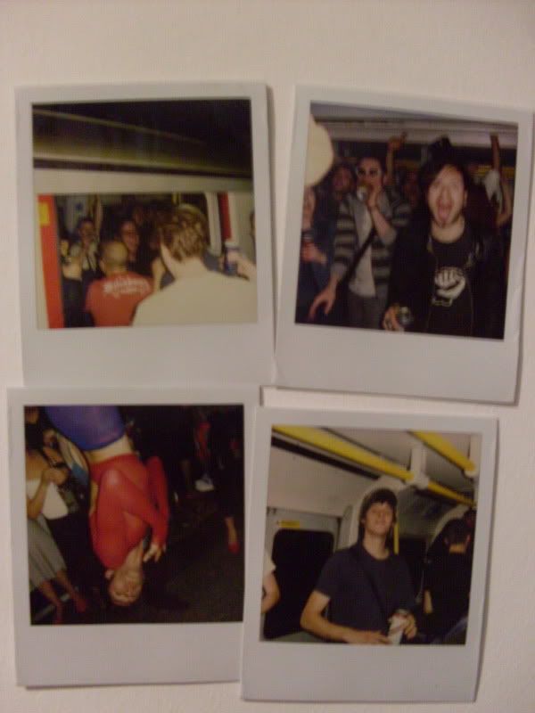 I took these 4 polaroids on the Last Round on The Underground party back in June, I avoided taking photos of the lairy men destroying lights and pissing on the seats, I wanted to capture how fun it was and how (most) people were out for a good time. The guy upside down was french and no one seemed to know who he was. he just hung there, yelling French words.
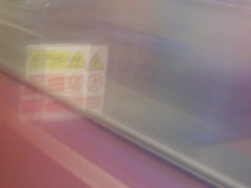 dispite this being a photo of the train speeding onto the platform, it looks really soft and quite feminine. The blurred reds and blues make a soft purple colour, shading over the Safety sign making it look far less threatening.
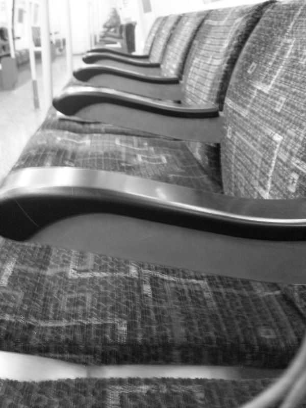 I didn't use this as one of my postcards because it didn't work with the others, but I really like the image. I hardly ever see an empty carridge so took a photo as it's quite rare. I was on my way to Morden and everyone had got off by Balham so I began to wonder if something had happened and i was an idiot for remaining on the train.
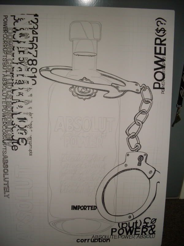 This was my final piece for the long long typography project back in October. At first i had so many ideas in my head, but trying to put them across while fulfilling the brief was bugging me down, and I think I got confused along the way. When we presented them only a handful of us had stuck to the brief 100%, and It made me wish i'd done something more that made me happy, rather than remain so committed to the words on the sheet.
i suppose that's my new years resolution for Graphics. I try too hard to be loyal to the brief and produce whats expected of me. I'd rather create a piece of work that i'd be proud to have in my portfolio, but have to defend my reasons for making it, than have something thats correct but dull and i don't care about.
No comments:
Post a Comment