Wednesday 3 June 2009

illustration class book


as a class we made a booklet compiling work we all did based on the topic of zookeeping, farm work and animals. my first was a herd of cows with supermodels faces, i wanted to do it very quick and the idea seemed quite funny at the time. the second is of a farmer hard at work in a field, with lyrics from Jay Z '99 problems' above his head. saying that although his life is tough and he has lots of problems, he has a lovely wife still. :)

Illustrated News

using geniune headlines found in papers, we illustrated their literal meaning using black ink on white paper.

bits & bobs

a few of the sketches i do out of class, including some flyer designs i do for a club in Milton Keynes.


The Ballad Of... continued.

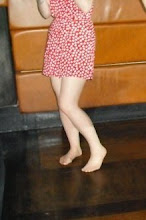
As i mentioned previously, during winter break i designed dresses based on the theme of neuveau archetecture. this spring we had our magazine shoot where the model wore my dresses. although the magazine has been delayed in printing, it has now been sent to press so will be out very shortly :) I'm pleased i got involved with this as it was good experience and i got really good feedback about the dresses i made.


Dream Dictionary illustration


Using the dream dictionary we illustrated a number of the entrys. rather than do several single illustrations i chose to make one long (very long) illustration compiling several explanations together, i liked the composition i created as it was symetical using different scenes to balance each side. i also made a large canvas illustrating a dream about a mens urinal.
we made A1 sized booklets using the sketches we did about the dictionary, and used print to apply colour. I made my own stamps using foamboard, and chose a basic colour scheme of black purple and pink. the outcome was quite blurry, but i think it was inkeeping with the topic of dreams.


Graphics rhythm & rhyme

This rhythm and rhyme project asked for us to create work relating to music, focusing on the lyrics and meaning. we were in groups and were thinking of how we could make features for the magazine we were making. my first idea was using line to show the beat of a song, illustrating the rhythm, but i wanted to look more at lyrics.


so i printed off lyrics to two of my favourite songs, Interpol's Rest My Chemistry and Paris by Friendly Fires, and made an image including all literal methaphors mentioned in the songs. I thought it could be used in the magazine as a pull-out poster, like every month there would be a new 'Literal Lyrics' poster.

Illustration book project


we created A1 sized booklets using the 3 colours cyan, magenta and yellow, using 50 illustrations we did from a catalogue of choice (i used Vogue magazine) below are a few of my illustrations.


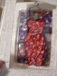
after making the three-colour booklet we had to make another book, in whatever way we wanted, representing the contents through how its made, i used fabric and different methods of constructing each page. one page is string with little coathangers , representing the topic of fashion. i titled the book Buy these you will be adored because people often feel pressured to keep up with trends to be accepted. the book folds out in an odd way because i didnt want it to be a traditional book.


Virtual presence for Graphics- Fashion Victims

thrift-and-make-shift.blogspot.com

we had to pick a theme given, between urban myths, vive la difference, and fashion victims, and make a real or virtual presence for it. i chose fashion victims as i have a huge interest in costume and textiles. the brief asked us to base it on our opinions and views, so i based mine on charity shops.
alot of people see charity shops as dirty and for old people, but i love them. i like being able to buy something very cheap and custimise it into something fashionable, i find it far more creative than buying from Topshop.
i used a font for the heading to look like sewn thread, and took inspiration from fashion blogs such as Facehunter and stylefinder's street style web pages. i used photographs i took of my own vintage and charity shop clothes, focusing on how you can get a designer-looking wardrobe from Oxfam at hardly any cost. I was very pleased with this project.

Re-package for Graphics


For this project we were given a topic, mine was 'Shorelines', to research and re-package somehow.
my initial thoughts with shorelines was of the coast, i never thought of abroad, always Britain, and traditional British seaside towns. I wondered what was typical of the seaside and postcards came to mind. I thought about how personal it feels recieving a postcard, and that someone has taken time to send it to you. I then thought about the kind of person i am, and what i'd like to recieve from someone. As our re-package had to be 16 pages i thought of some kind of puzzle, where the pieces are recieved individualy but you are given clues as to how they fit together.
i kept the rectangle shape of the postcards, but made each page as a cell, with a piece of the whole image on it, so when they're stacked in order (with the number on the back) it forms a whole image of a seaside town.
each sell is sent in its own envelope, all addressed to myself.
i called the project Wish You Were Here.