Monday 19 January 2009

whoops...

For some reason it wont let me edit the post below the last haha. but these are the posters my group (me, jayde, carla and stacy) designed. it was for an exhibiton to show our font/quote posters. our group was called Scribbles and we used colours loyal to UEL, and the correct logos. we wanted it to look like it belonged at UEL, it was recognisable and rather than people dismiss it as a poster for a rubbish club, they'd think as it was for UEL it was almost compulsory for them to read it to see if it was important to them. I think they successfully combines each of our styles.


ASSEMBLAGE.

some pages from my diary of London when i was making the postcards. rather than be a strict diary i made it more into a scrap book and wrote notes and doodles over stuck-in images.

a few pages from my assemblage folder. i glued together 3 ringbinders and covered them in scraps of vintage material, night club flyers, gig tickets, receipts and broken things from my room, like headphones. i love collages and being able to add things as i go so it says alot about me. inside i have clear folders to store things in. a card i was given from a girl whos phone i found on the DLR and traced it back to her. she was so grateful and gave me a fiver. in the card she put ''i didnt think there were many honest people around anymore'' which was so nice to read. i believe in karma so that made me smile. i also have a Captain America comic i got from a comic store in LA when i met Stan Lee. ive used this project as a scrapbook of my life.


i collect envelopes addressed to me, because i get alot of stuff off amazon and ebay and like seeing peoples handwriting, or how they package things. its a bit wierd. but i had alot in my room so wondered how i could make them into something else im interested in. and as i enjoy making costumes i thought a Self-Addressed Dress would be quite fun. its held together with packing tape and staples, and its made with the same pattern as a proper dress, but is card.


Graphics round-up for assessment

We had a project to produce a photographic style for an events or gallery space, and have a corportate identity. Me, Carla and Stacey decided upon Westminster tube station, and it has a very industrial look and would work well as a nightclub, like Matter or Fabric. We took photos in the station of areas that represent our idea, and photoshopped in bar areas, drinks offers, and new signage. the club would be called The Westminster.
Our idea was that we could show the potential of a disused tube station to a backer and renovate the space into a contemporary nightclub.


A mock-up of how The Westminster would look with people in it.


we thought the areas at the back would work well as bars.


the two ideas boards we had for The Wesminster, they would be a proposal for a potential sponsor of our club. in it we say that we have two dancefloors, a kareoke area, VIP areas, and a live music area.


as myself (Eve) stacey and carla are in our group, we decided that Sec Promotions is a good title as it includes the first letters of our names and sounds quite good.


Below are the other 4 postcards from my series of Underground images. They represent feeling trapped and clastraphobic.


Below is the photograph i took in the style of Larry Burrows, a vietnam war photographer who was killed when his helecopter was shot down in Laos in 1971. He documented the real lives that go on during the war, of the soldiers and nurses and fellow journalists.
Burrows version is of a leutenant laying on his bunk, reading letters sent from his family back home. surrounding him are his essentials, backpacks and rugs and basic clothing. In my photo i've surrounded myself with complete non-essentials, clothes and bags and fashion magazines. I wanted the photos to be similar but different.


We were givin a famous quote and a font, my font was Akzidenz Grotesk, and my quote was from J. E. E. Dalberg-Acton.
''Power corrupts but absolute power corrupts absolutely''
realist sans (meaning, without)-serif typeface released by the H. Bethold AG type foundry in 1896 with the title Accidenz- Grotesk. first sans serif to be widely used. it is derived from the font Didot. The Akzidenz-Grotesk family now has 14 varients. H. Berthold AG is one of the most successful typeface foundaries. Established in 1858 by Herman Berthold and based in Berlin. Akzidenz-Grotesk was used as a model for the font Neue Haas Grotesk, now named Helvecta.
I began thinking of images that quote connotes, like bent politicians and criminals. But also literal meanings of powerful, like a power drill. I didnt want to go directly with policemen or politicians because it seemed too obvious, but i liked the idea of involving corrupt law in the poster.
One of the most successful advertising campaigns ever, and a favourite of mine, are the Absolut Vodka posters where a single bottle has a 'personality' or character to it. Absolute Corruption would work, i thought, so to have cufflinks draped over the bottle neck to represent law would be clever. And i could have the quote written in the script writing the Absolut bottles have.
As you can see below, i used the font i was given to spell out ABSOLUTE CORRUPTION by writing the phrase over and over, but leaving a white space, so from afar you can read the quote through it.


Mid-way through the final piece, it was all black and white ink on mountboard.


This is the sketch I did of the final poster, when I was working out different ways to represent the quote.


An idea I wish i'd gone with is a contemporary take on such an old quote, the idea that power is wealth and fame, and the more famous and rich you get, the more sordid and dark you life becomes. A person who represents this idea nowadays is Amy Winehouse.


a scan from my sketchbook, you can see how the words and spaces show the word 'Absolute'. I had another idea of a hand writing a corrupt document, and the final sentence would be that same J.E.E Dalberg quote.


Saturday 3 January 2009

The Ballad Of...

Back in deepest darkest November i was feeling pretty unmovtivated, and as time goes on i found myself becoming more interested in textiles and fashion design rather than graphic design. I went in search on google for possible work experience at theatres, as i'd love to get into theatre production and costume design, and found a page about work experience at Channel 4.

expecting a page on vacancies for tea-makers and phone-answerers i was surprised to see information on a new magazine C4 are helping promote, called 'The Ballad Of...'
I emailed the girls organising it, and asked for more information and if i could get involved, they told me it was a magazine made by young creative talent, for young creative talent. I told them i was an illustrator who dabbled in textiles and they said as they have plenty of illustrators already, if i could do something with clothing that'd be great.

with the theme of 'Neauvau' i emailed back with ideas of clothing inspired by art deco and neauvau archetecture, listing designers who'd inspire me and what fabrics i'd use. they got really excited at my ideas and i set about sketching dresses.

so i emailed the ideas and they loved them, so now im in the process of making the dresses and they're getting me a model and photographer for a shoot i can style.

It's been fun having people believe in my work enough to reserve pages in their magazine for me, it feels like a big responsiblity and I hope the outcome is as good as i imagine it will be. I'm just grateful for the experience.

I'm also glad i decided to be pro-active in my Graphics-slump, rather than sit here and get nothing done.


Hello 2009.

This post is a round-up of the projects i've been finishing before my assessment in a couple of weeks.

We had a task of producing 8 postcards representing London as we see it. They had to have a common theme running through each and be personal to us.
I went with a very traditional style of rectangular postcard with black lines on the back with spaces for address, text and stamp. my postcards were photos printed at Asda, but with the postcard layout found on google images glued on the back. a bit of a cheat but i think they look pretty cool.

My theme was the underground, as it's so representative of London and both tourists and people who live here must use it on a regular basis.
It's both the bain of peoples lives, and what they rely on to travel. Its interesting how much we depend on it.

I'm quite claustraphobic, so although I enjoy the underground (people watching, especially) i hate the cramped conditions and horror stories of fires and being unable to escape.

these are my 4 favourite postcards i made. the colours are all quite similar (red, blue, white, black) but each has it's own message.

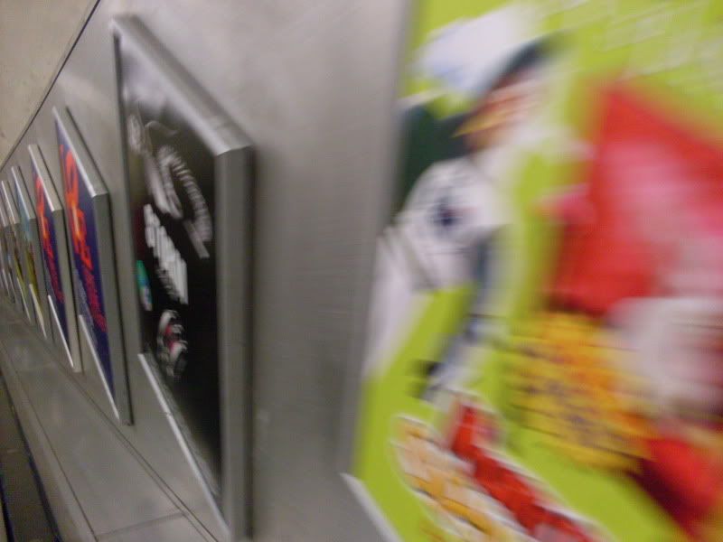
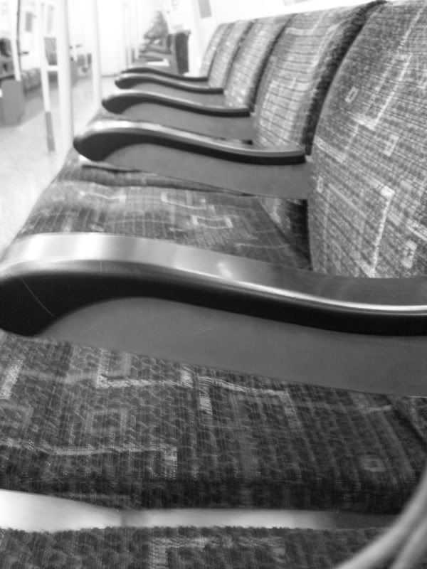
this postcard shows the descent underground, the silver walls feel industrial and harsh. I really like the lines across the image, it draws the eye to the direction you're heading.
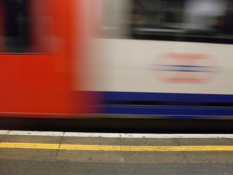
I didn't mean to take this one, I was trying to turn my camera off but pressed shoot instead. I like the mix of blur and clear, the train looks like it's going so fast but was just about coming to a halt. Everything feels sped up underground.

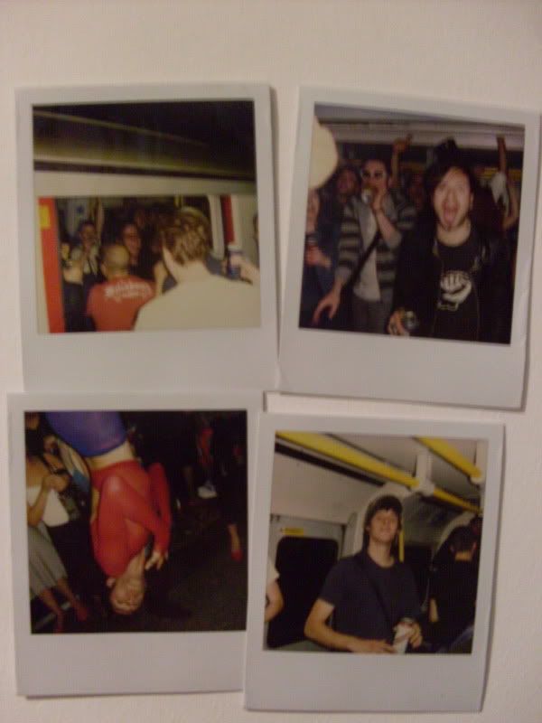
I took these 4 polaroids on the Last Round on The Underground party back in June, I avoided taking photos of the lairy men destroying lights and pissing on the seats, I wanted to capture how fun it was and how (most) people were out for a good time. The guy upside down was french and no one seemed to know who he was. he just hung there, yelling French words.

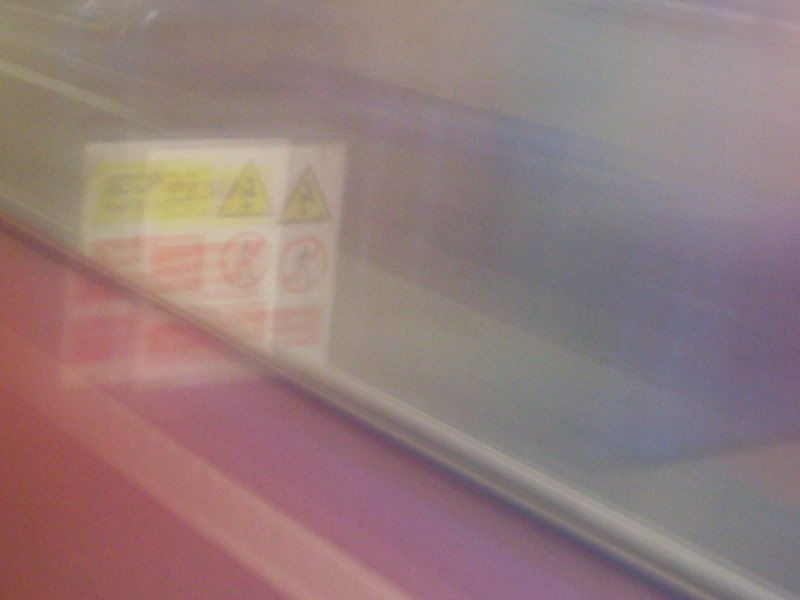
dispite this being a photo of the train speeding onto the platform, it looks really soft and quite feminine. The blurred reds and blues make a soft purple colour, shading over the Safety sign making it look far less threatening.


I didn't use this as one of my postcards because it didn't work with the others, but I really like the image. I hardly ever see an empty carridge so took a photo as it's quite rare. I was on my way to Morden and everyone had got off by Balham so I began to wonder if something had happened and i was an idiot for remaining on the train.


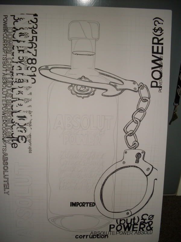
This was my final piece for the long long typography project back in October. At first i had so many ideas in my head, but trying to put them across while fulfilling the brief was bugging me down, and I think I got confused along the way. When we presented them only a handful of us had stuck to the brief 100%, and It made me wish i'd done something more that made me happy, rather than remain so committed to the words on the sheet.

i suppose that's my new years resolution for Graphics. I try too hard to be loyal to the brief and produce whats expected of me. I'd rather create a piece of work that i'd be proud to have in my portfolio, but have to defend my reasons for making it, than have something thats correct but dull and i don't care about.