Wednesday, 3 June 2009
The Ballad Of... continued.
Dream Dictionary illustration
Graphics rhythm & rhyme
Illustration book project
Virtual presence for Graphics- Fashion Victims
thrift-and-make-shift.blogspot.com
we had to pick a theme given, between urban myths, vive la difference, and fashion victims, and make a real or virtual presence for it. i chose fashion victims as i have a huge interest in costume and textiles. the brief asked us to base it on our opinions and views, so i based mine on charity shops.
alot of people see charity shops as dirty and for old people, but i love them. i like being able to buy something very cheap and custimise it into something fashionable, i find it far more creative than buying from Topshop.
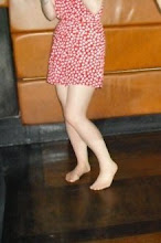
i used a font for the heading to look like sewn thread, and took inspiration from fashion blogs such as Facehunter and stylefinder's street style web pages. i used photographs i took of my own vintage and charity shop clothes, focusing on how you can get a designer-looking wardrobe from Oxfam at hardly any cost. I was very pleased with this project.
alot of people see charity shops as dirty and for old people, but i love them. i like being able to buy something very cheap and custimise it into something fashionable, i find it far more creative than buying from Topshop.
i used a font for the heading to look like sewn thread, and took inspiration from fashion blogs such as Facehunter and stylefinder's street style web pages. i used photographs i took of my own vintage and charity shop clothes, focusing on how you can get a designer-looking wardrobe from Oxfam at hardly any cost. I was very pleased with this project.
Re-package for Graphics
For this project we were given a topic, mine was 'Shorelines', to research and re-package somehow.
my initial thoughts with shorelines was of the coast, i never thought of abroad, always Britain, and traditional British seaside towns. I wondered what was typical of the seaside and postcards came to mind. I thought about how personal it feels recieving a postcard, and that someone has taken time to send it to you. I then thought about the kind of person i am, and what i'd like to recieve from someone. As our re-package had to be 16 pages i thought of some kind of puzzle, where the pieces are recieved individualy but you are given clues as to how they fit together.
i kept the rectangle shape of the postcards, but made each page as a cell, with a piece of the whole image on it, so when they're stacked in order (with the number on the back) it forms a whole image of a seaside town.
each sell is sent in its own envelope, all addressed to myself.
i called the project Wish You Were Here.
The Conversation
for our illustration brief 'The Conversation' we were told to focus on peripheral vision, and the things we hear when we're not meant to. like on public transport, or when you accidentally over hear someone elses conversation. watching people when they dont know youre doing it, or being followed yourself. use these ideas as a starting point and make 6 images worthy of your portfolio, but use your own natural style of working.i chose to break mine down to 6 subjects, being watched and fear, being watched and protection, celebrity gossip, malicious gossip about yourself, funny overheard conversations and internal thought. i used collage and layering with text to create a complex image, representing our own thoughts and words. the original art is colour, but i chose to display it Black and white as after scanning the layers are flattened but you still get texture, and the black and white theme brings each piece together. Im very happy with this work, I feel it's one of my strongest of the year.


Subscribe to:
Posts (Atom)