Wednesday, 17 March 2010

Dress design ideas


These are the 3 designs i like the most, each incorporating elements of the font in different ways. my favourite is the top design (or in the middle in the image above) but rather than the area between the skirt and lettering be hollow, i may use the hidden scaffolding idea from the sketch on the left. i think this would make the design more sturdy.

Patterns for Graphics FMP.


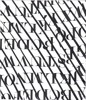
Here i'm looking at patterns i can make using strips of printed Modern no. 20 text. I'm still unsure if im going to use printed fabric on the actual skirt, but want to experiment a bit before i decide.

Paper Dress, graphics FMP experiment


before settling on my final design and making it with fabric, im looking at construction methods using paper. i kept to the design i liked the most from the 3 i'd sketched and wanted to make the dress look as good as possible, with few visable staples and sellotape. this proved difficult as the skirt is full of rolled up paper to give it shape. ive left a hole in the skirt to show the paper underneath.
the dress has a proper zip down the back, and includes elements of pleats, tucks, crossed over paper and it is also tailored to fit me exactly.
its not quite finished, but will post more images when its done, and of me wearing it.

Friday, 5 March 2010


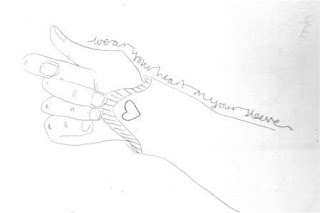
first sketches of new illustration project, A Turn Of Phrase. illustrating old phrases in a contemporary way. my first idea was to draw the old meaning but now i want to look at print and showing the phrases in their literal manner.

this is a sketch from my 'past' sketchbook. i based it on memories and photos from childhood and last summer. this is a montage of friends from a night out. will upload more when i scan them in.


over christmas we had a brief to complete three sketchbooks, with the themes of Past present and future. above are my favourite pages from the Future book. I imagined a planet overrun with aliens and strange landscapes, the aliens are supermodels heads on snail/rabbit bodies and the landscapes are made up of expensive jewellery and diamonds. i liked the idea of mixing the futuristic emements with a retro style, the landscapes look like theyre from the Jetsons.